EXPERIENCE, LOVE, CREATE ART

CRIMSON STAR COMICS
MY WORK AS A FEATURED COMIC ARTIST

WHO ARE WE?!
We are Crimson Star Comics, a small team of local writers and artists working together to boost the local art scene by creating our very own comics from scratch. We pitch, write and illustrate our own comic books for all sorts of genres - this way, we hope to create a comic universe for everyone!

MY ROLE
I joined CS Comics (then known as The Fandom Menace) when I was 15, as part of my school's Work Experience Program. Since then, I've been working closely with writers to illustrate their scripts, be it short one-offs or full comic book issues. While I mostly take up colouring roles these days (filling in the lines done by previous artists), I have illustrated full stories (Crimson Star Book One) from start to finish, which also entails working with the writer to improve panel flow and scene dynamics.

FEATURED:
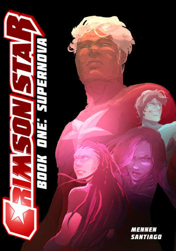
CRIMSON STAR BOOK 1
Follow the journey of a Singaporean journalist who sets off to big ol' New York City in CRIMSON STAR BOOK 1, written by mentor and good friend Ryan Mennen, and illustrated and co-directed by me. Named after our local football legend Fandi Ahmad, our journalist-turned-superhero Fandi, is just like every other ambitious Singaporean starting a new life overseas; except this writer is friends with an alien (also known as a Caelumite). However, things go south quickly, and Fandi is soon faced with a responsibility he's never anticipated.
You can buy CRIMSON STAR BOOK 1 for $25 SGD now, or enjoy our other comics. Support our team today - even if it's just a chat! We love talking about all things comics.

HOW IT'S DONE
Every comic artist has their own style. I just happen to have a few, all developed and discovered over time as I learnt how to make professional comics for an audience beyond my own social circle. I've always drawn comics, but Crimson Star Book One (which includes 3 issues) was my very first go at creating a published story. I also started on it when I was 16, fresh out of O Levels. So naturally, you can see drastic changes over time, from lineart to colouring style. In a way, it's a documentation of an artist's growth over time - not just in technical skill, but in emotional and mental maturity too.
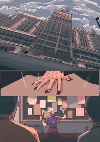
Typically, comic artists start off with storyboarding, adhering closely to a pre-written script. If it's by another writer, chances are the panel directions have already been laid out, and many writers would prefer to have their script closely followed - they've got the vision after all. However, I've been very fortunate to work with writer Ryan Mennen, who allowed me to change the panel directions based on what I saw fit. Because of the artistic freedom I had, the original 65-page script evolved into the final 77-page comic book. With added panels to improve visual flow and enlarged panels to dramatise specific scenes, I believe the story became more powerful and emotionally moving, all while still holding the readers' attention.
ISSUE ONE - DIVING HEADFIRST
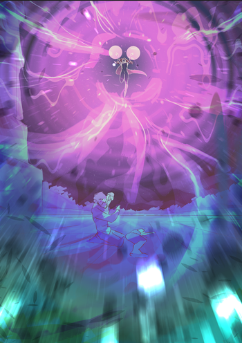
Issue One throws us right into the superhero shenanigans - fighting robots, throwing beams of light at enemies, subtle interspecies romance, et cetera. As our writers are huge comic geeks, our stories take inspiration from classics like Spiderman, hence it was rather easy to establish a style both audience and creators are familiar with. As such, I could quickly adopt a more American-comic style even though I was not familiar with it (I'm much more used to drawing manga).
At the time, I happened to be an avid reader of Bryan K. Vaughan's and Fiona Staples' Saga, a sci-fi graphic novel about family values and overcoming the odds in the midst of a racial war. While the story on its own is already fantastic and one-of-a-kind with its fun raunchy elements, Staples' art brings it to a whole new level, thanks to her expressive thick lines, convincing expressions and realistic body anatomy. I just had to learn from her, so I observed her artworks and incorporated her style into my own drawings for this project.
In the end, the first issue was well received by both audience and our team, and I was immensely proud of the work I created.
ISSUE TWO - A HEALTHIER APPROACH
Now that I had gotten the hang of illustrating an official comic book, I wanted to try changing a few things to better suit my own needs while still creating high-quality work. It's no secret that artists tend to develop physical ailments, be it carpal tunnel or backaches, no thanks to horrendous posture and inevitable burnout. That's why Issue 2 has a more sketchy approach to it, with thinner ballpoint lines and painterly colouring. While I prefer the look of Issue One, the process tended to be quite physically intensive. For one, I was not used to the American comic style, hence I had to be a lot more careful with my lines and colouring, which entailed adding a lot more pressure to my stylus. It took a toll on my wrists and finger joints, hence I had to change my method for Issue 2.
Being traditionally trained, I was much more comfortable with lining my work with a ballpoint pen on paper, then scanning it for digital colouration. With this approach, I was much faster and more comfortable, but in hindsight, I feel it's not as powerful as the first issue. Because I rushed the lines and used only my pen, the lines lacked that signature thickness that would have added more emotion to the characters. Because the lines are significantly thinner, the colours overpowered them and sometimes even led to the pictures losing their definition.
Despite this, Ryan still liked the art so I considered it a job well done. While I'm admittedly slightly disappointed in the art, I won't beat myself up over it as it was a first-hand learning experience which taught me how to better balance work and health.

Scanned lines

Digital colouration
ISSUE THREE - THE BEST OF BOTH WORLDS
Now that both issues had been completed, I had a better understanding of what was best for both me and the audience. With 5 days to complete 35 pages (I was stuck in quarantine right after coming back from London during the pandemic), I managed to quickly complete the digital lineart, but with a quicker pace and less pressure on the lines. This way, the typical comic book appearance was at least somewhat preserved. With that, I used the same painting techniques for the colouring job and created the illusion of realism for the backgrounds with rough painting and Gaussian blurs. Eventually, I met the deadline and we could finally reach Book One's conclusion. A truly satisfying feeling!


FEATURED: LEGIONARIES #2

MY ROLE AS A COLOURIST
Legionaries Issue 2 is a comic written by writers Ryan and Sathya, and illustrated by the talented Malaysian artist Zehe Abdul Rahman. Like most stories about Greek mythology, this one features the classic heroes such as Perseus and Hercules, except this version's Zeus is reincarnated as a young American boy named Joseph.
While I was initially not meant to work on Legionaries, issue 2 was handed to me for the colouring job last minute as the team realised the original method wasn't feasible time-wise. As the original art was traditionally inked and painted by Zehe on watercolour paper, the process tended to take many days, mostly for the paint to dry. Hence, I was tasked to take over the colouring digitally, while still having to maintain that traditional watercolour look.
I had never really painted with a watercolour style on my program before, so I took to observing the colour bleeds and paper textures from the previous issue. I then replicated those effects using the digital brushes and various painting techniques using my software.
Eventually, I finished colouring the 24 pages within a week or two. Though I'm still more of a fan of the vibrant comic art I'm used to, I'm glad I was able to do Zehe's inks justice while still meeting the team's deadline.
Beefytaur Special Edition Cover for SG Comic Con 2023

ARTIST'S PICK: SINGAFIST
Growing up with Tite Kubo's Bleach (one of the "Big Three" animes worldwide), I took inspiration from his art style and slowly but surely, made it my own. With its unique eye and nose shapes, Kubo's style is perfect for teenage-appropriate comics as the characters are full of expression and vitality. So when prompted with the Singafist script, I went in with full enthusiasm as I finally got to illustrate a published comic in the style I had honed for years.

ARTIST'S ALL-TIME FAVE
SPIDERMAN: OH, THE PLACES YOU'LL GO!
Ever heard of Free Comic Book Day? Well, it exists. And in 2021, we decided to revive one of Ryan's old scripts which he pitched to Marvel Comics way back when.
In this story, follow teenage Peter Parker as he tries to keep the city safe while the big guys are out doing their usual hero stuff. It's got classic comic book quips, lots of action and a unique painterly style.
While the full book is not available for reading (due to copyright reasons; we just made it as fanart), you can view some of my favourite pages here.

EVERYTHING ELSE
Throughout the year, I'm also tasked to do random commissions, variant covers, anniversary posts and merchandise designs too. Check all of them out here!


